As the company expanded its digital experiences, two design systems emerged: one supporting internal tools and one serving consumer products. The consumer system had no clear ownership or maintenance plan, which led to duplicated components, inconsistent visuals, and uneven accessibility. Engineering teams rebuilt similar patterns across products, creating unnecessary rework and slower delivery.
As Senior Product Designer, I directed the strategy and execution for the consumer design system from research through rollout. I defined the vision, led the component audit, established accessibility standards, rebuilt core architecture, and introduced long term governance. My work focused on improving design and engineering alignment, strengthening accessibility practices, and building a structure that scaled across products and teams.
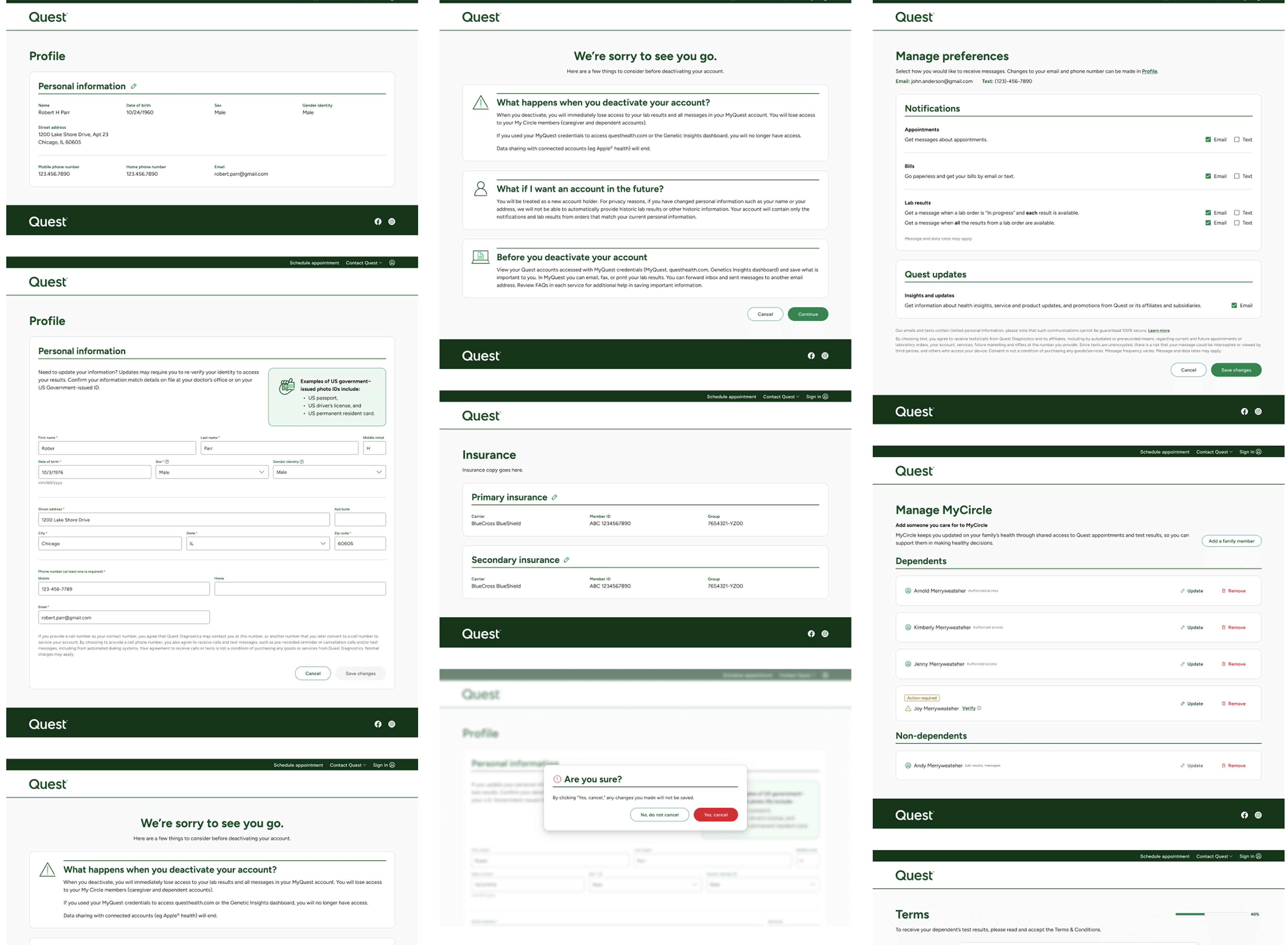
The consumer design system had grown without oversight. Components varied across platforms, documentation was outdated, and accessibility fell below required standards. Each team solved design problems independently, which caused fragmentation and slowed releases.
At the same time, the internal design system followed a different architecture, making collaboration difficult. My challenge was to rebuild the consumer system so it could stand on its own while staying aligned with shared principles and engineering practices.

I led a comprehensive audit across five active consumer products. Each component was evaluated for usage, consistency, accessibility, and technical reliability. I partnered with engineers to compare design assets with production code and worked with QA to trace recurring UI issues. I compiled the results into a visual matrix that revealed overlaps, inconsistencies, and ownership gaps.
Key Takeaways

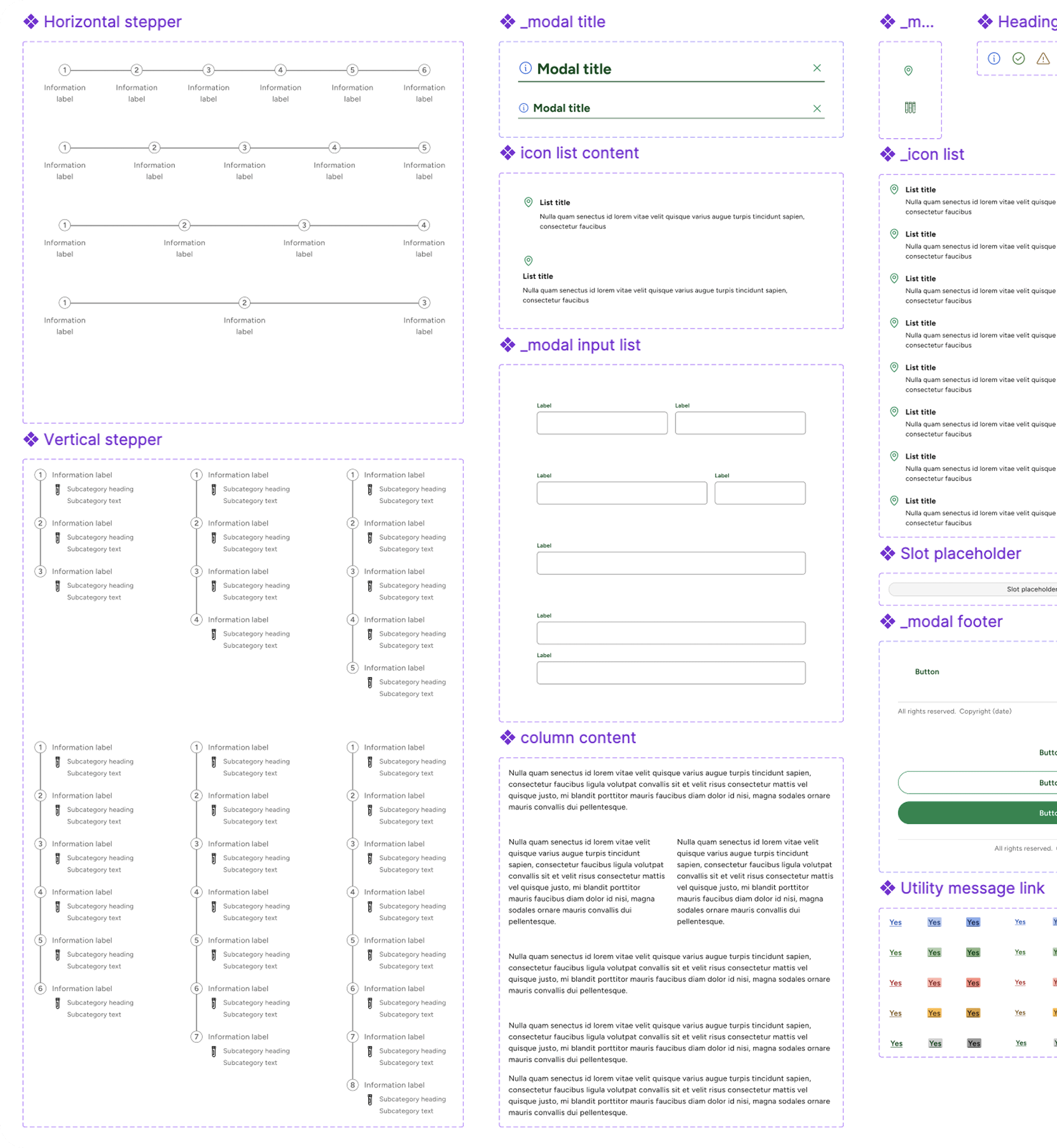
I redesigned the system architecture around four principles: accessibility, scalability, consistency, and maintainability. Each component was rebuilt from the foundation up, which included color, spacing, and typography that matched production variables.
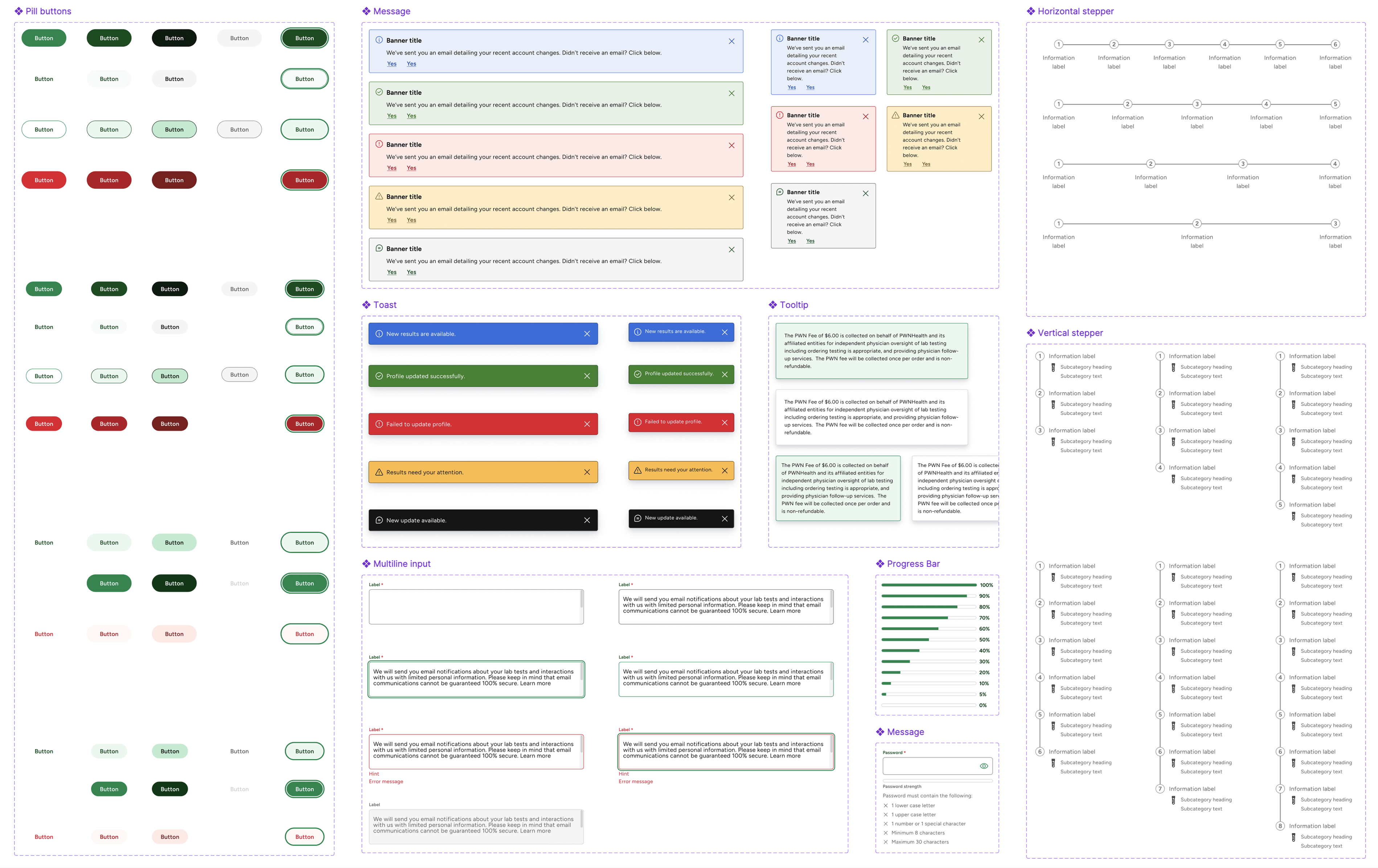
Example: Message Components
The banner pattern existed in several forms across products, each with different colors, paddings, and dismiss behaviors. I led its redesign to create one accessible, flexible component that could adapt to multiple use cases.


I partnered with engineering to define motion behavior, focus states, and semantic color mapping for information, success, warning, and error. Each variation was tested with assistive technology for readability and keyboard navigation. I documented clear rules for placement, stacking, and usage scenarios to ensure predictable interaction across products.
Key Takeaways


I established the collaboration framework that connected design, engineering, and QA. Each component variant in Figma matched a coded state in production, creating a direct reference that reduced QA errors.
I created onboarding kits, self-guided documentation in Confluence, and a component starter file for new designers. I also launched a governance group that met monthly to review proposals, validate new requests, and track adoption metrics.
This model ensured that decisions were transparent and that improvements came from the entire community, not just one team.
Key Takeaways

I defined success metrics around adoption, accessibility, and delivery speed. I hosted internal demos, ran office hours, and partnered with product leads to plan migrations. I also developed dashboards that tracked component usage and accessibility compliance across products.
Within six months, adoption reached 85% across consumer teams. The system improved quality, speed, and accessibility while reducing redundant work.
Once the core system reached stability and high adoption, my focus shifted toward ensuring its sustainability and scalability across multiple product lines. I worked with design and engineering leads to define a component lifecycle process, so updates could be proposed, reviewed, and released consistently across all consumer products.
I also established an accessibility maintenance plan to ensure compliance remained consistent as new patterns emerged. This included setting up review checkpoints with QA, refining documentation for accessibility annotations, and integrating accessibility validation into the standard design review process.
Key Takeaways
I evaluated how the system changed the company’s design culture. Designers no longer treated the system as a static library but as a shared product they could improve. Engineers started proposing enhancements, and the governance group evolved into an ongoing design council.
Key Takeaways
The consumer design system evolved from a fragmented library into a scalable, accessible platform that connected teams and streamlined production. It reduced redundancy, improved delivery time, and created a shared visual language across all consumer products.
By leading strategy, structure, and adoption, I helped transform design operations into a unified system that balances clarity, inclusivity, and speed, a framework now used across multiple product lines.