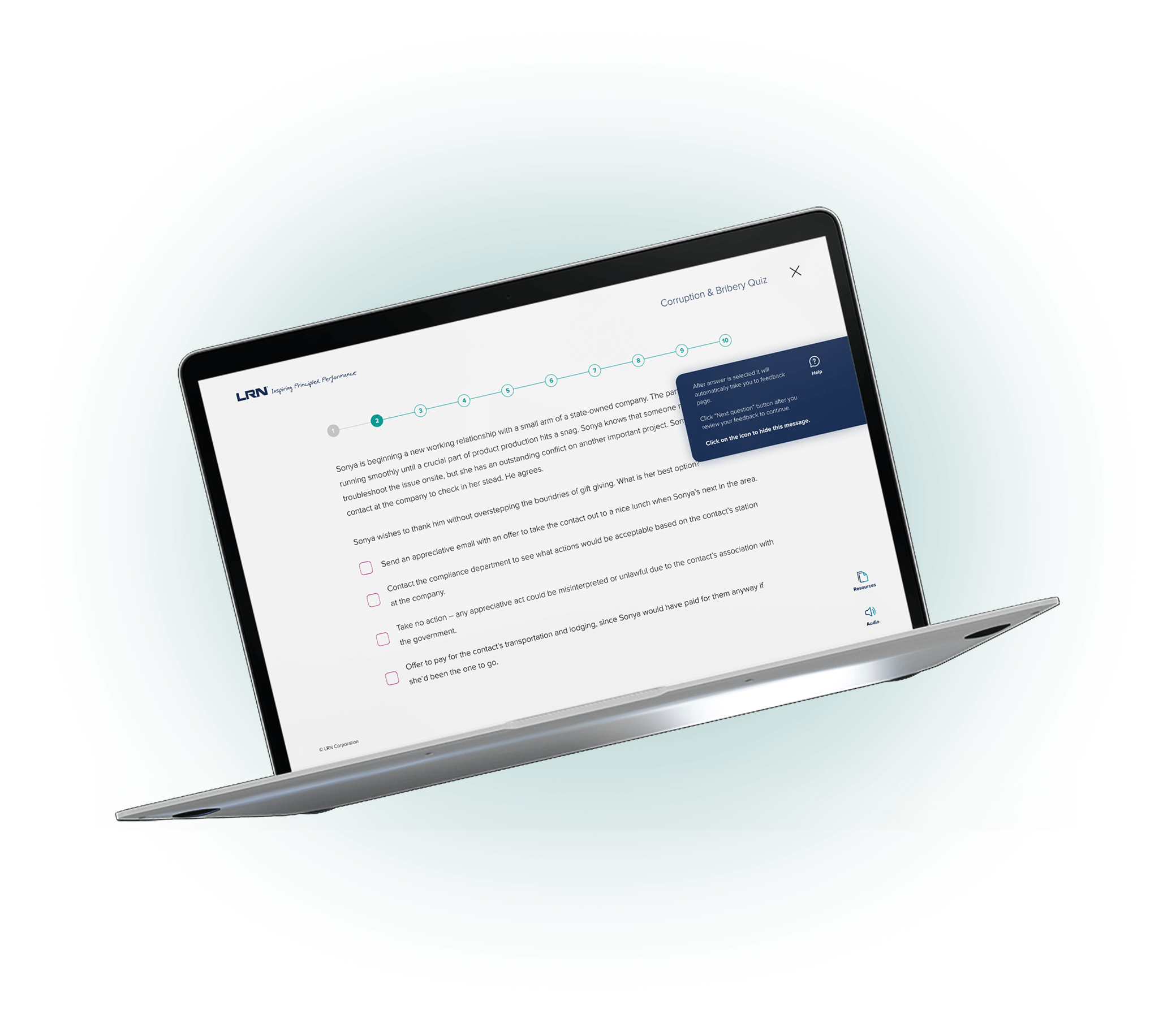
The Smart Compliance Quiz was part of a larger redesign of a learning platform that helps employees complete regulatory training efficiently. I designed an adaptive quiz that allows learners to demonstrate knowledge upfront and skip redundant content while maintaining full compliance with company and legal standards.

Traditional compliance training forced learners to repeat modules annually, regardless of prior knowledge. It was time-consuming, disengaging, and rigidly controlled by compliance policies. The system also lacked the flexibility to track adaptive progress.
The challenge was to create an experience that respected both user efficiency and strict compliance standards while working within limited platform capabilities.

My Role
I defined the design strategy, reframed the problem from a content issue to a structural one, and coordinated across engineering, legal, and product teams to identify what flexibility was possible.
Key Takeaways
I reviewed learner feedback, engagement data, and prior support logs to understand where friction occurred. I benchmarked against other learning systems to study how adaptive quizzes could maintain trust while improving efficiency.

My Role
I led research planning, analyzed data patterns, and translated findings into design requirements focused on fairness, clarity, and compliance validation.
Key Takeaways
I created adaptive flows that let learners test knowledge at the start. Those who passed moved to completion; those who did not were directed to short, targeted lessons. Each path was designed to preserve audit requirements while reducing redundancy.
I tested multiple flow options internally to ensure learners always understood where they stood in the process and what each decision meant.

My Role
I designed and validated the flow logic, refined branching structure, and worked with compliance specialists to confirm all legal standards were upheld.
Key Takeaways
I designed modular UI components including question cards, feedback messages, progress indicators, and score summaries. Each element followed system standards for accessibility and branding while ensuring adaptability for future use across other training modules.

My Role
I created the component library, aligned visuals with system guidelines, and partnered with developers to ensure coded components matched design specifications.
Key Takeaways
I designed for mobile and desktop to ensure accessibility across all environments. Testing covered layout adjustments, touch targets, keyboard navigation, and screen reader compatibility. Every interaction followed WCAG AA standards to ensure usability for all learners.

My Role
I guided responsive adaptations, verified accessibility compliance, and collaborated with QA to validate real-device behavior.
Key Takeaways
Although the project did not reach launch, it had a lasting influence on how compliance products were planned and structured. The quiz design introduced a new way of thinking about adaptive learning within regulated environments. The documentation, flows, and component structure were later referenced by other teams as a model for modular, compliant learning tools.


This project proved that compliance and adaptability can coexist without compromising integrity. It shaped how I approach design in complex, regulated environments by reinforcing the need for alignment between usability, system thinking, and stakeholder trust.
While the feature did not launch, the work demonstrated that meaningful design progress can happen through structure, collaboration, and foresight. The lessons learned informed later efforts to standardize accessibility, modularity, and data handling across learning tools.
